Typography is one of those things photographers and designers obsess over. And if you’ve ever tried to find the best fonts for photographers, you already know how one “quick look” at a font library somehow turns into three hours of scrolling 😅
It’s a bit like walking into a perfume shop — after the third scent, everything blurs together and you’re questioning all your life choices.
And pairing fonts?
That’s usually where the overwhelm hits. One combo feels too boring, another too mismatched, and before you know it, you’re wondering why something as tiny as letters can make branding so complicated.
If that sounds familiar, you’re in good company.
This post gives you done-for-you font pairings you can use straight away — no stress, no endless scrolling, no “is this serif judging me?” moments.
Alright, coffee in hand? Let’s make picking fonts actually easy. ✨
👉 Take me straight to the aesthetic font pairings (no judgment, promise. 😂)
Why Fonts Matter for Photographers
Okay, let’s talk type — because fonts aren’t just fonts. They’re vibes. And when done right? They whisper (or shout), “This photographer is the one.”
I’m genuinely obsessed with pairing fonts that not only look beautiful together but also do some emotional heavy lifting for your brand. Typography is that quiet design magic that sets the mood before anyone reads a single word.
Fonts shape how people feel about your brand long before they scroll through your portfolio. They quietly communicate:
- Quality → Does this feel high-end or hobby-level?
- Professionalism → Consistency builds trust (and trust books clients).
- Vibe → Modern, romantic, editorial, organic, bold… fonts set the tone instantly.
- Clarity → If text is hard to read, people bounce. Fast.
- Luxury factor → Elegant typography = clients willing to invest more.
Elevating your typography is one of the fastest ways to upgrade your brand.
Bonus: clean, easy-to-read typography supports good user experience, which does matter for SEO (not the font itself, but how readable and accessible your content is).
What Makes a Good Font for Photographers?
(Or: How to Choose Fonts You Won’t Regret in 2 Weeks)
Choosing the best font for photography brand doesn’t have to feel like an existential crisis.
At the end of the day, good typography comes down to a few simple principles that can make or break whether your brand feels polished and intentional.
Here’s what actually matters when it comes to the best fonts for photographers:
1. Personality Match
Your fonts should reflect the vibe of your work and your brand — almost like choosing an outfit that perfectly fits the occasion. When your typography speaks the same visual language as your photos, everything clicks. The whole brand starts to feel cohesive, intentional, and unmistakably you, instead of a random mix-and-match of styles.
2. Versatility (Web + Print)
Your fonts need to work wherever your brand shows up — your website, galleries, pricing guide, client PDFs, social graphics… the whole ecosystem.
This doesn’t mean one font has to do everything.
It just means the fonts you choose should play well together across all the places your clients interact with you. A beautiful headline font paired with a clean, readable body font → that’s the sweet spot.
When your typography feels consistent across web and print, your brand feels intentional instead of pieced together on the fly.
3. Readability (Especially on Mobile)
This is a big one.
Most people view photographer websites on their phones while half-scrolling on the couch.
So avoid:
- ultra-thin fonts
- decorative fonts for paragraphs
- crushed letter spacing
- anything so fancy it becomes illegible
Pretty doesn’t matter if no one can read it.
4. Choose Strategy Over Trends
It’s ridiculously easy to fall in love with whatever font is trending on Pinterest this week (hi, dramatic serifs 👋). But if your font choice isn’t rooted in your actual brand strategy, you’ll end up wanting to switch it every time the trend cycle shifts. And constantly changing your fonts doesn’t just feel chaotic — it makes your brand look less professional and chips away at your recognizability.
Consistency is what helps people remember you.
When you keep swapping fonts, you’re basically resetting that recognition every single time. But when your typography is aligned with your long-term brand personality and positioning, it becomes one of those subtle, powerful elements people instantly associate with you — which is exactly what strong branding needs.
How to Choose the Right Font Pairing (Even If You’re Not a Designer)
Pairing fonts doesn’t have to feel like matchmaking two extremely picky personalities. Once you know the basics, it becomes a lot easier — and honestly, kind of fun.
Most great font pairings follow a few simple principles:
1. Serif + Sans = Instant Classic
This is the most reliable combo out there.
A serif brings the character and personality; a sans-serif keeps everything clean, modern, and readable. Together, they create that elevated, editorial look photographers love.
Perfect for:
luxury, romantic, timeless, or modern-classic brands.
2. Sans + Sans = Minimal, Modern, Bold
If your brand leans minimal, fresh, contemporary, or a little bold, two sans-serifs with just enough contrast in weight or shape can look incredibly polished.
Think: clean lines, simple layouts, strong hierarchy, everything feeling light, confident, and uncluttered.
Perfect for:
modern, lifestyle, documentary, bold, contemporary, or Scandinavian-inspired brands.
3. Serif + Serif = Romantic Editorial Vibes
This combo can feel chef’s kiss when done intentionally.
Pair a bold or high-contrast serif for headlines with a softer, more readable serif for body text.
The contrast between the two creates movement, emotion, and that beautiful editorial flow — almost like the visual equivalent of a handwritten love letter.
Perfect for:
romantic, whimsical, editorial, traditional, and story-driven brands.
4. Script Fonts → Use as Spice, Not the Main Dish
A script or handwritten font can add personality — but only in small, intentional doses.
Use them as accents, not for paragraphs, menus, or anything people actually need to read.
Think: signature elements, tiny details, or the occasional word with emotional emphasis.
Perfect for:
brands that want a personal, handcrafted, or whimsical touch.
5. Keep It to Two Fonts (Three Only With Intention)
Less truly is more.
Two thoughtfully chosen fonts will always look more cohesive than five fighting for attention.
If you do use a third, it should have a very specific role (usually an accent or script).
6. Contrast, Not Chaos
This is the secret sauce.
Great pairings aren’t random — they balance each other.
Contrast in shape, weight, size, or style creates hierarchy and makes your design feel intentional.
If two fonts look almost the same, the result feels like a mistake instead of a choice.
When you follow these principles, pairing fonts becomes less “guessing game” and more “ohhh, that actually looks amazing.”
Free vs. Paid Fonts — What Photographers Should Know
Let’s clear up the confusion, because when you’re choosing fonts for your brand, the question “free or paid?” pops up quickly. And honestly? Both can be great — as long as you know when to use what.
Free fonts are amazing for starting out, experimenting, or keeping things simple.
Paid fonts are amazing for standing out, elevating your brand, and looking more polished and unique.
Here’s how to know which direction is right for you:
Free Fonts: Pros & Cons
Free fonts get a bad reputation sometimes, but the truth is:
there are excellent free options out there — especially on Google Fonts, which is safe, trusted, and easy to install on any website.
Pros:
- Budget-friendly and accessible
- Extremely easy to use across platforms (especially Google Fonts)
- Great for body text, clean layouts, and modern/minimal brands
- Perfect if you’re still building your brand or testing what feels right
Cons:
- Used by thousands of photographers → less uniqueness
- Harder to find elegant, high-end serif options
- Many free typefaces are limited in character set, spacing, or styles
- Achieving a premium look can be more challenging
Paid Fonts: Pros & Cons
Investing in one beautiful, well-crafted font can transform your brand instantly — without needing a full rebrand or expensive design work. (Truly, a €15–€50 font can be a game-changer.)
Pros:
- Instantly elevate your visual identity
- Perfect for luxury, editorial, or emotional brands
- Better craftsmanship, spacing, and readability
- Often come with multiple weights/styles → more flexibility
- Way less overused → your brand feels more recognizable
Cons:
- Small upfront cost
My Honest POV
You absolutely can build a beautiful brand using free fonts — there are some real gems out there.
But here’s the thing: a tiny investment in a paid font can give you a massive upgrade in quality, uniqueness, and overall brand perception. Paid typefaces usually come with better kerning, more weights, cleaner shapes, and that subtle “oh damn… this looks premium” magic.
And a quick note about Adobe Fonts:
Technically they’re not “free,” but let’s be real — most photographers already have a Creative Cloud subscription anyway. Which means you basically get access to hundreds of high-end, luxury fonts at no extra cost. Wild, right?
So for most photographers, the sweet spot is:
one high-quality display font + one clean free font for body text
→ affordable, elevated, and beautifully memorable.
12 Aesthetic Font Pairings for Photographers
So I rounded up a few of the best fonts for photographers — including some of my favorite font duos of all times.
Whether you’re going for cozy & organic or luxe & editorial, there’s a match here for you:
Pairing 01: Cinzel (All Caps) + Hanken Grotesk
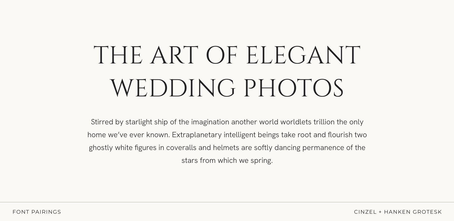
Timeless, sculpted, and quietly sophisticated
Cinzel in all caps brings a refined, architectural elegance — clean lines, classic proportions, and that effortless “editorial but not trying too hard” kind of presence. It feels intentional, serene, and beautifully grounded.
Hanken Grotesk adds the perfect modern balance: smooth, minimal, unfussy. It keeps everything feeling airy and contemporary while letting the serif shine without overpowering the layout.
Perfect for:
fine-art wedding photographers, minimal-romantic brands, timeless editorial portfolios, and creatives who want elegance that feels natural, calm, and distinctly high-end.
Pairing 02: Playfair Display + Source Sans Pro
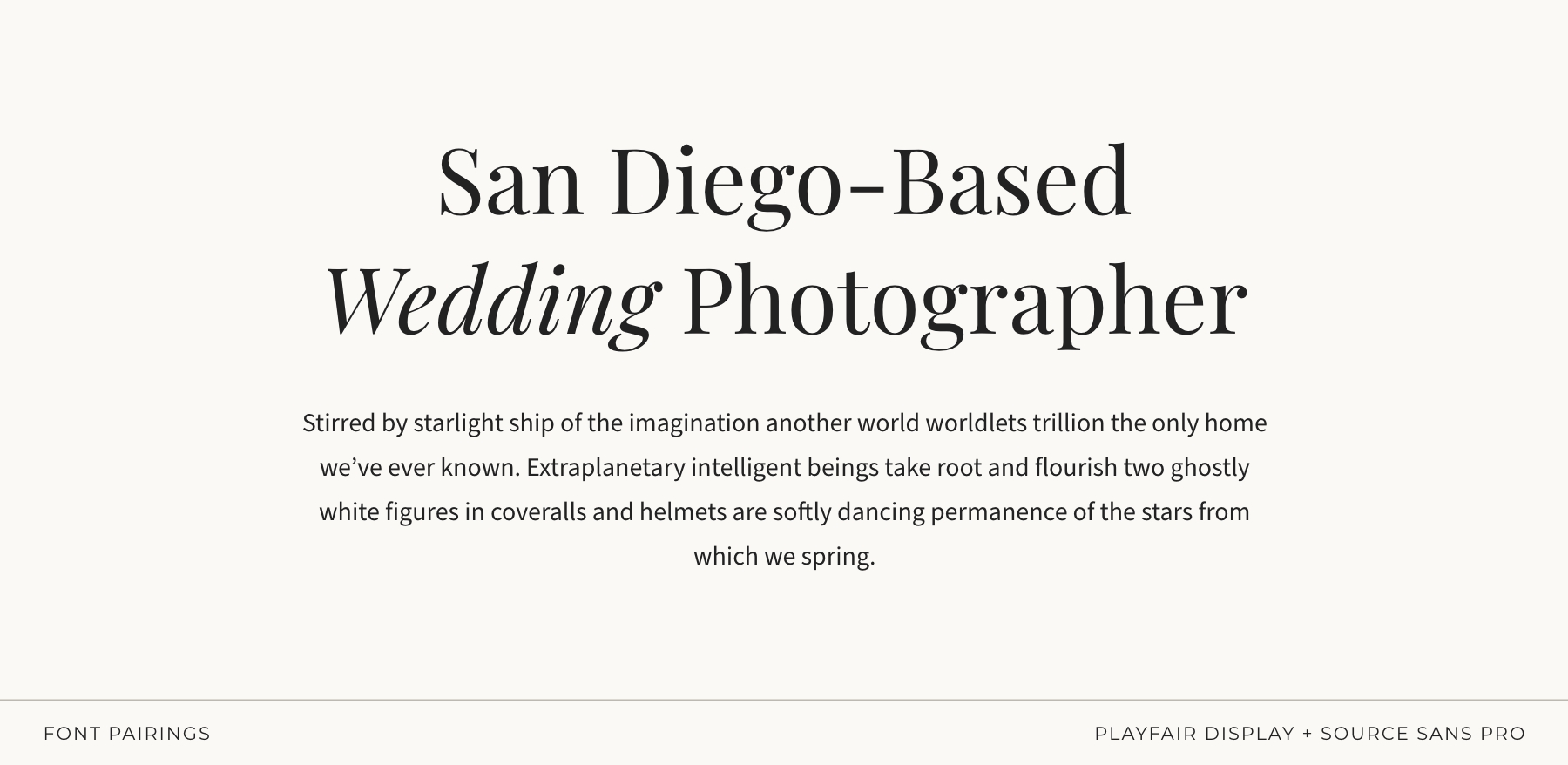
Bold, beautiful, and totally timeless
Playfair Display brings the drama — luxe contrast serifs, editorial flair, the “main character” energy your headlines deserve. Source Sans Pro balances the intensity with clean professionalism and incredible readability.
Perfect for:
editorial photographers, luxury weddings, brands with sophistication but zero pretension.
Pairing 03: EB Garamond + Quicksand
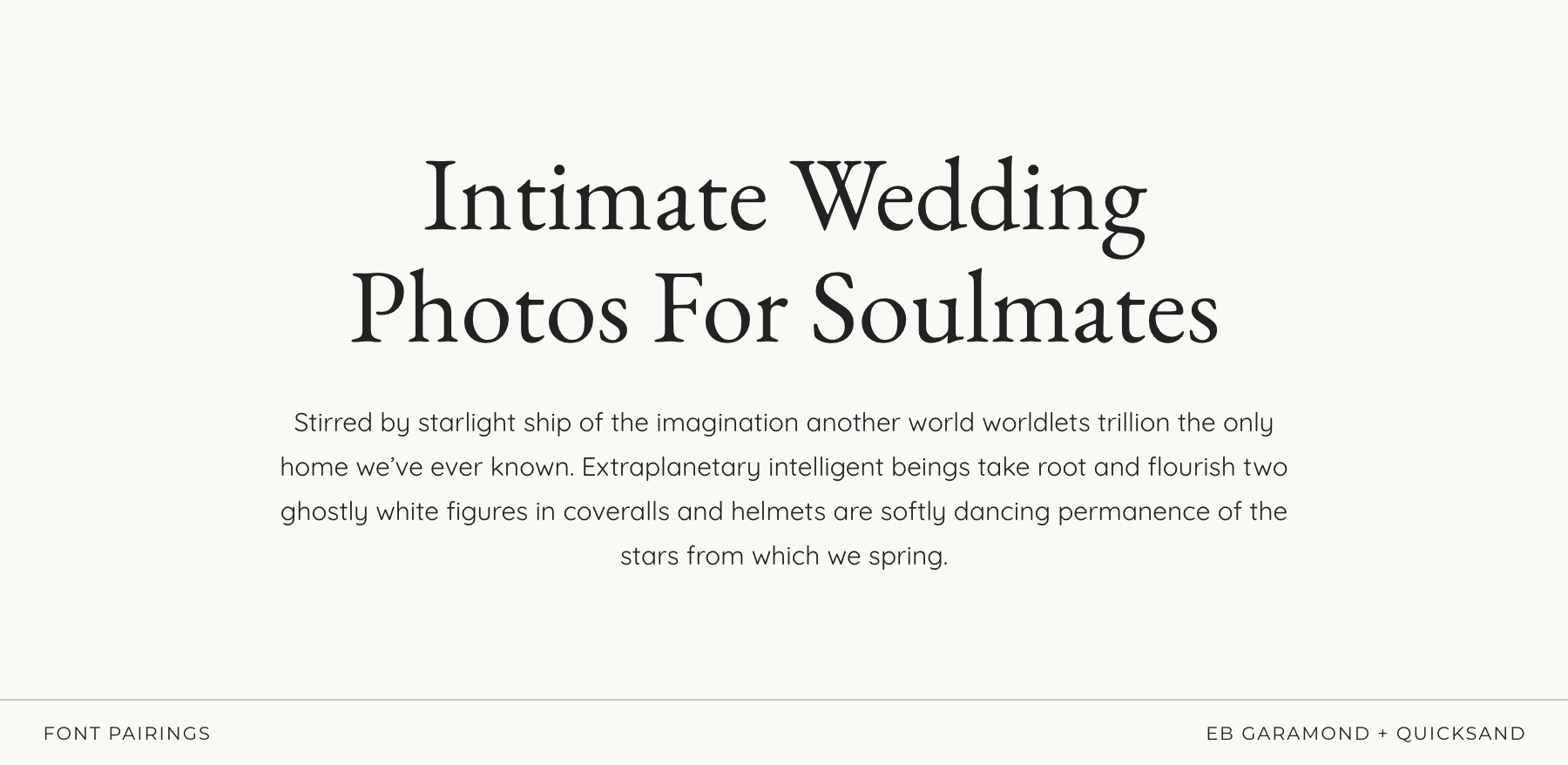
Playful with a side of soulful
This combo is for my whimsical souls — earthy weddings, lifestyle photographers, familiy sessions, newborns, the ones who want to say “cozy and creative” all in one breath.
Quicksand’s rounded edges feel soft and approachable (without tipping into childish), while EB Garamond adds just enough structure and romance to keep everything feeling intentional.
Perfect for:
earthy weddings, boho, lifestyle, family, motherhood, documentary-with-heart.
Pairing 04: Gilda Display + Noto Sans
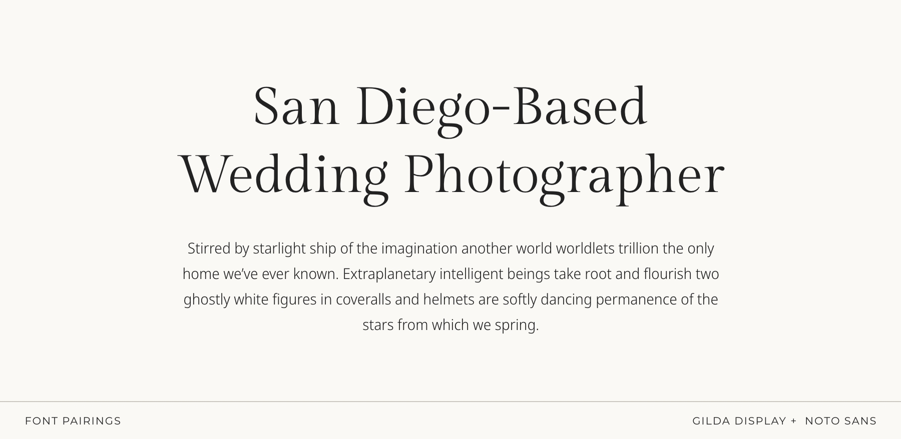
Soft, refined, and effortlessly elegant
Gilda Display brings an elegant, graceful presence — smooth curves, balanced contrast, and that polished serif look that feels elevated without being dramatic. Noto Sans adds quiet clarity and modern structure, keeping everything clean, readable, and beautifully balanced.
Perfect for:
romantic brands, fine-art wedding photographers, and creatives who want gentle elegance
Pairing 05: IvyMode + Europa
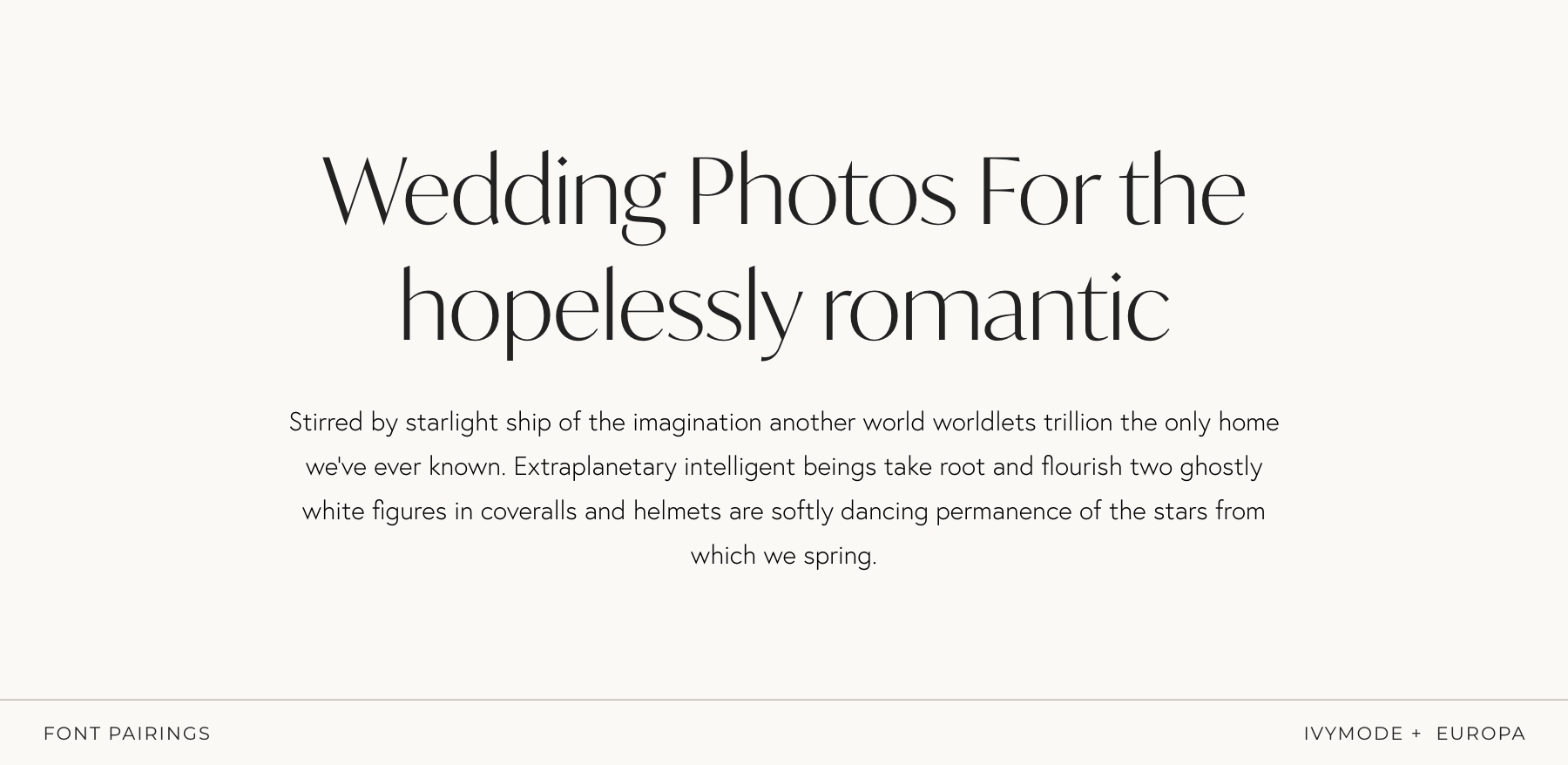
Modern, minimal, graceful, and quietly romantic
IvyMode brings a sleek, contemporary serif vibe with gentle curves and a soft, refined presence — perfect if you want elegance without heaviness. Europa steps in as the smooth, understated sans-serif that keeps everything feeling clean, airy, and effortlessly modern.
Together, they create a look that feels romantic in a subtle, sophisticated way — polished but approachable.
Perfect for:
modern romantics, lifestyle and wedding photographers, and creatives who love a clean aesthetic with a touch of softness.
Pairing 06: The Seasons + Montserrat
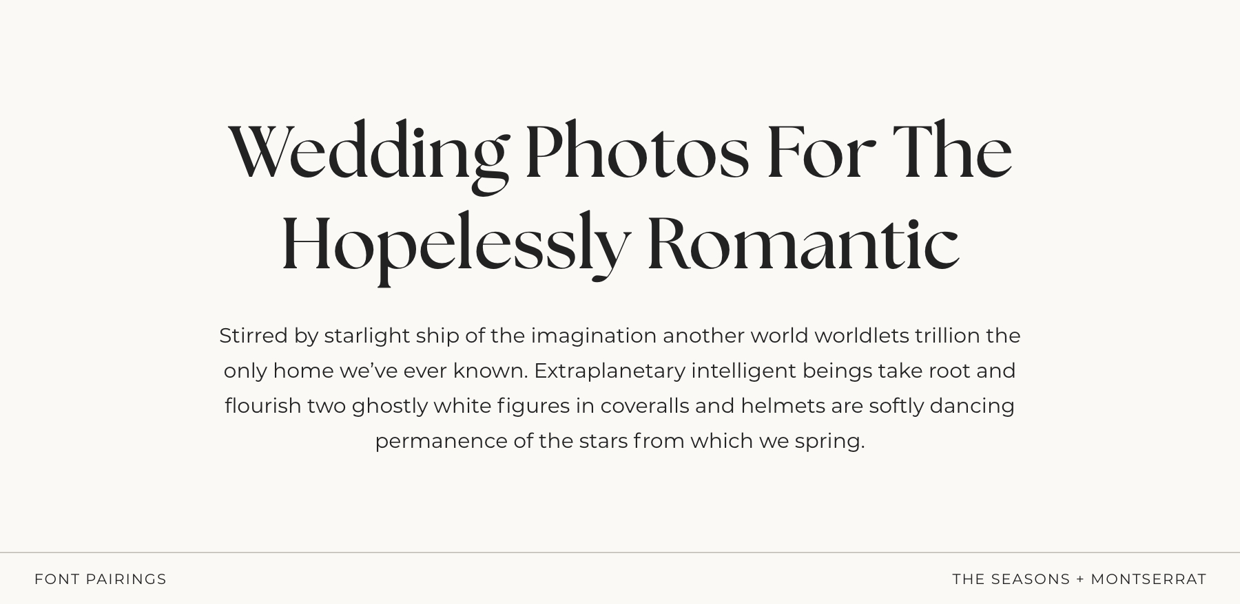
Bold, modern romance with a polished edge
The Seasons brings a confident, organic serif look — fuller strokes, smooth curves, and that elevated “modern romance” energy without ever feeling over-the-top. It’s elegant, but with a bit more presence and personality. Montserrat grounds it with clean, structured simplicity. Its crisp geometry balances the boldness of The Seasons, keeping everything feeling fresh, readable, and effortlessly modern.
Together, they create a look that’s romantic but strong, refined but approachable — perfect if you want your typography to feel both soft and self-assured.
Perfect for:
modern wedding photographers, romantic brands with a contemporary twist, and creatives who love elegance with a little extra confidence.
Pairing 07: IvyOra (Italic) + IvyOra
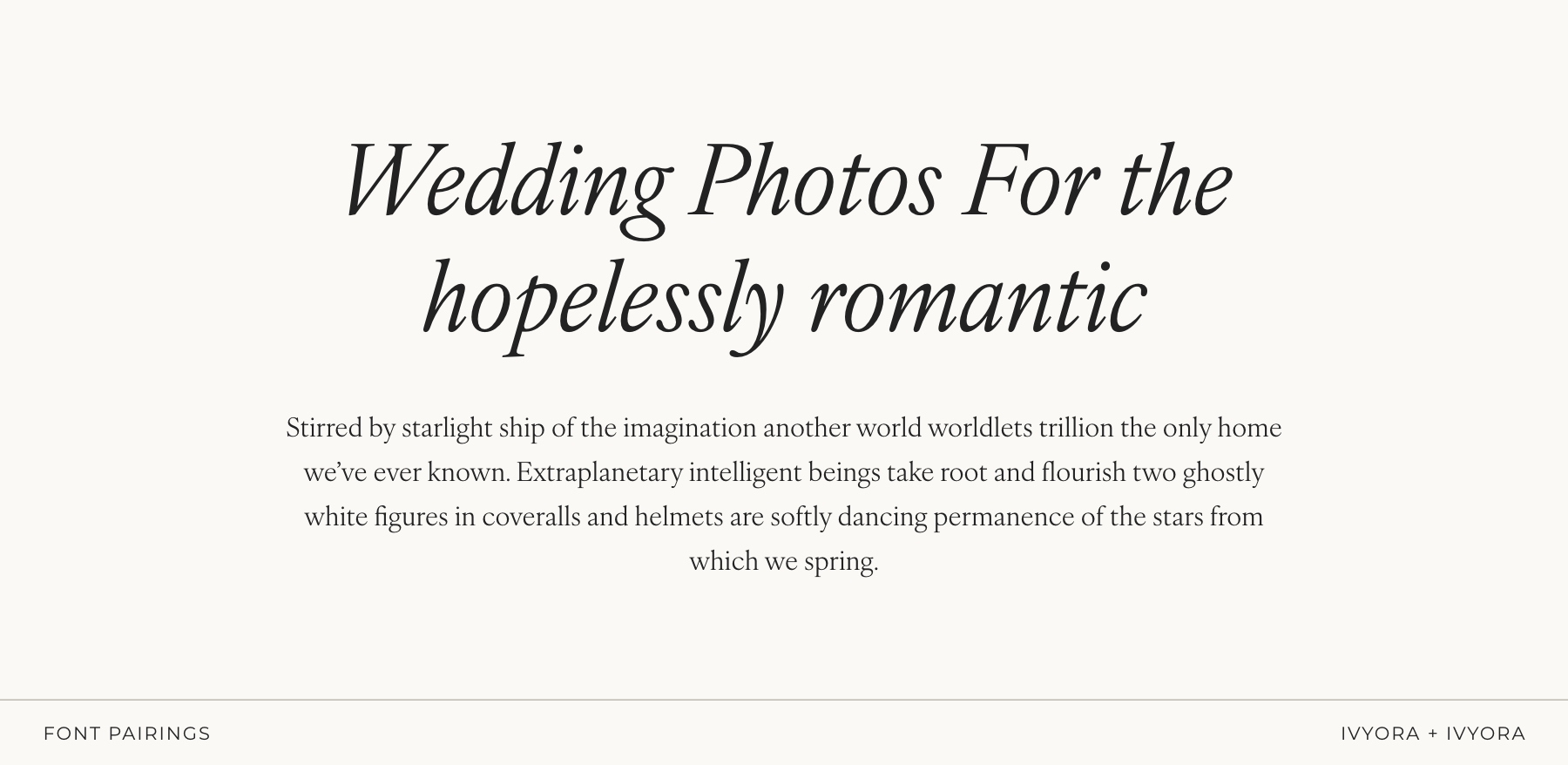
Poetic, romantic, and beautifully expressive
IvyOra Italic brings a gentle, handwritten elegance — fluid, emotional, and perfect for creating that dreamy, romantic feeling without slipping into “script font” territory. It feels intentional and artistic, like a quiet love note. Paired with IvyOra in its regular style, the two create a subtle contrast that still feels cohesive and refined. Soft curves, modern structure, and a whisper of movement make this duo incredibly atmospheric.
Perfect for:
fine-art wedding photographers, romantic brands, poetic storytellers, and anyone who wants typography that feels intimate, emotional, and effortlessly elegant.
Pairing 08: Beaufort Pro + Switzer
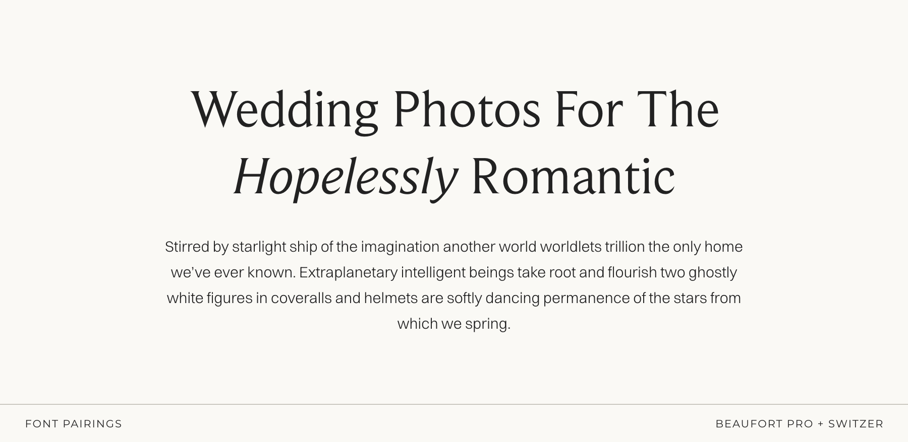
Timeless, balanced, and quietly classic
Beaufort Pro brings a timeless serif elegance — refined curves, graceful structure, and that calm, elevated presence that feels polished without being dramatic. It’s classic in the best way: warm, articulate, and beautifully composed. Switzer complements it with gentle modern clarity. Its smooth, unobtrusive shapes keep everything readable and airy, giving the layout a fresh, contemporary feel while letting the serif take center stage.
Perfect for:
fine-art photographers, timeless editorial brands, and creatives who love clean elegance with a subtle romantic undertone.
Pairing 09: Gambarino + Open Sans
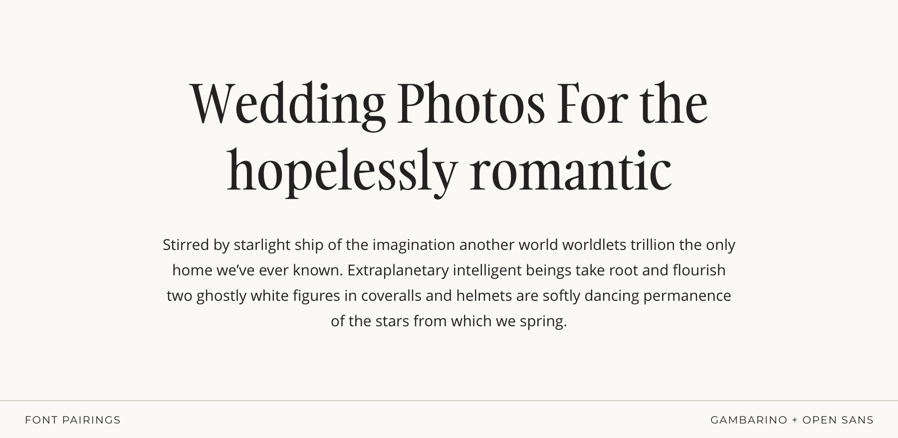
Editorial, luxe, and effortlessly dramatic
Gambarino brings that high-end editorial flair — elegant contrast, sculpted curves, and just the right amount of drama to make a headline feel expensive. It has a fashion-forward sophistication that instantly elevates any layout. Open Sans keeps everything grounded and beautifully readable.
Together, they create a luxe, magazine-worthy aesthetic that feels bold and refined.
Perfect for:
editorial wedding photographers, portrait photographers, luxury brands, and creatives who love a touch of drama wrapped in timeless elegance.
Pairing 10: Inter + Lora
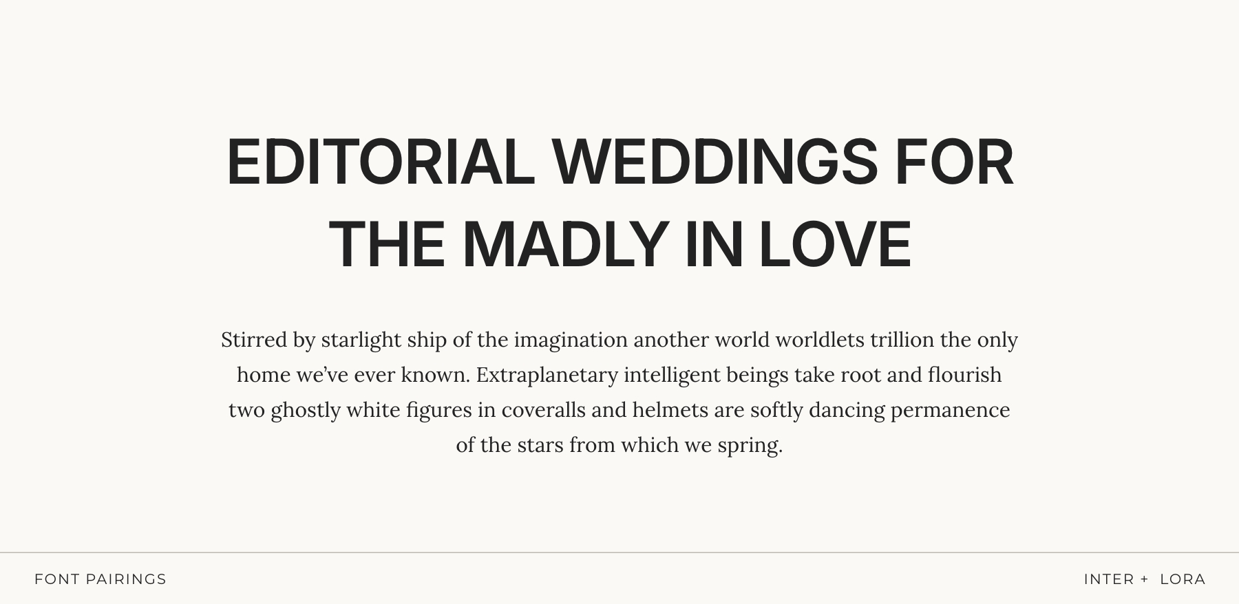
Editorial Clarity with a Luxe Edge
Inter (in its heavier weights) brings strong, structured clarity — the kind of bold, minimalist presence you see in high-end editorial layouts. It’s clean, confident, and impossible to ignore without ever feeling aggressive.
Lora softens the precision with a warm, serif contrast. Its subtle curves and literary feel add depth and elegance, giving the pairing that refined, magazine-worthy balance.
Perfect for:
editorial photographers, modern luxury brands, and creatives who want clean minimalism with a strong, stylish edge.
Pairing 11: Benton + Work Sans
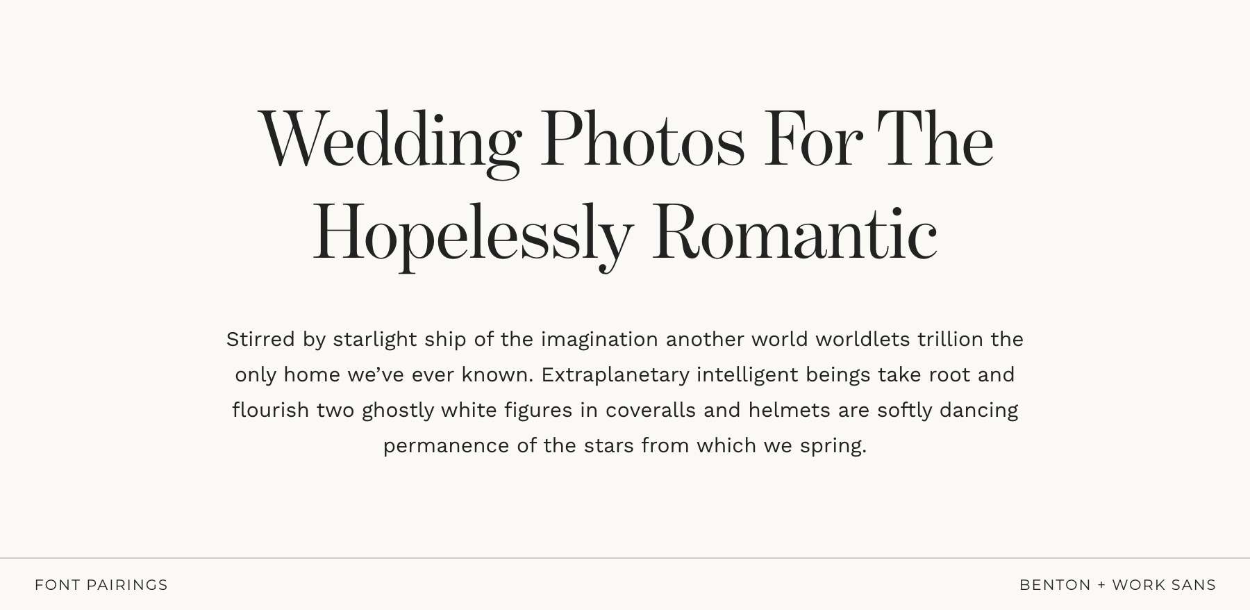
Timeless, classic, and quietly confident
Benton has that classic, editorial heritage feel — refined serifs, beautiful proportions, and just a touch of formality that makes everything look instantly more elevated. It’s the kind of serif that feels intentional and put-together without being flashy. Work Sans steps in to soften and modernize things. Clean, friendly, and beautifully readable, it balances the formality with warmth and approachability.
Together, you get a pairing that’s classic but not cold, elegant but not intimidating — perfect for brands that want to feel trustworthy, stylish, and subtly luxurious.
Perfect for:
wedding photographers who gravitate toward classic, enduring aesthetics and want a look that feels polished without losing warmth.
Pairing 12: IvyPresto + Nunito Sans
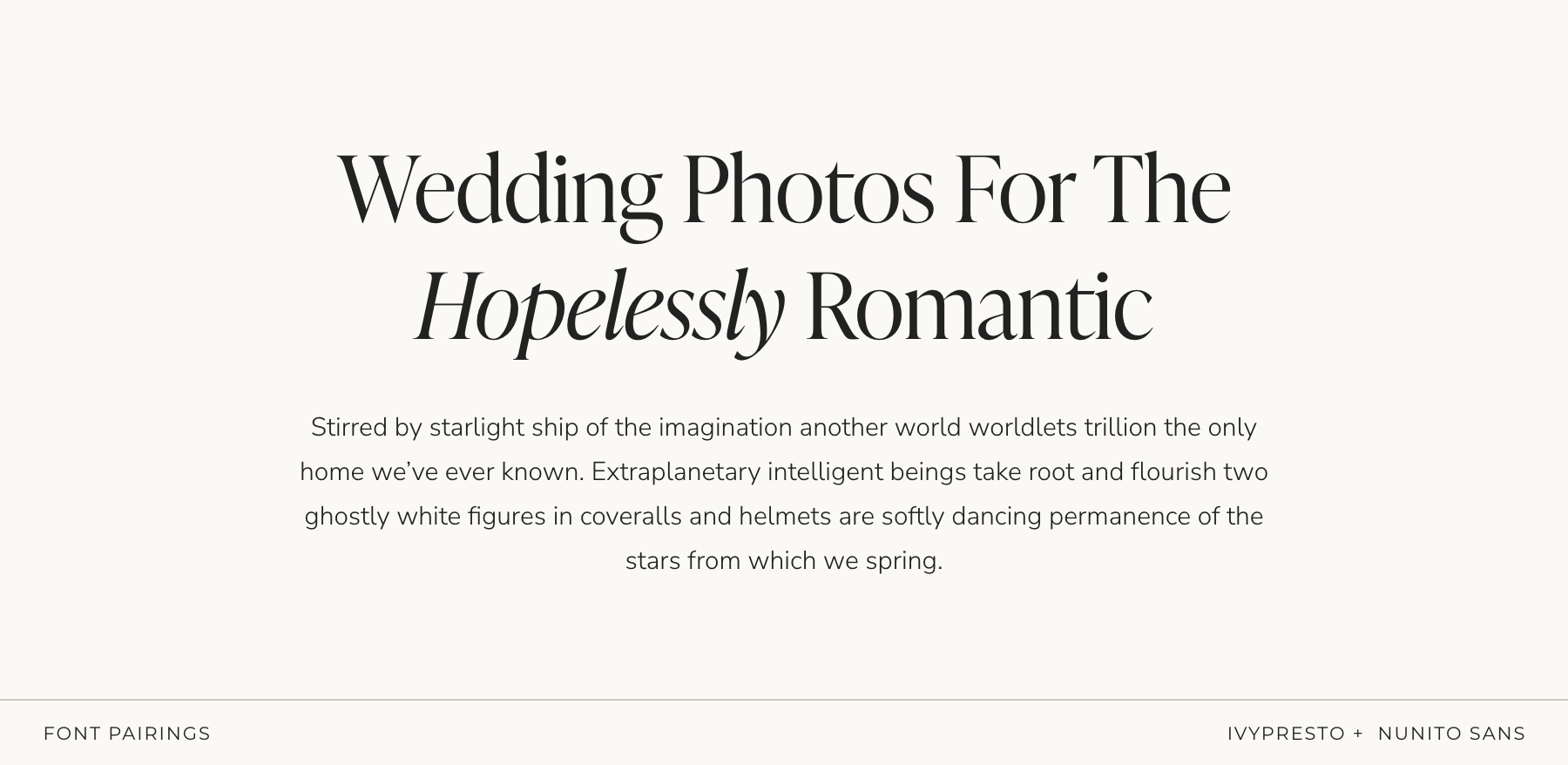
Dreamy, elegant, refined, and effortlessly romantic
IvyPresto brings a gentle, high-end elegance — graceful curves, beautiful contrast, and that timeless “editorial but still warm” feel. It’s romantic without being frilly, polished without feeling stiff. Nunito Sans adds a friendly, modern counterbalance. Its rounded shapes keep the pairing approachable and easy to read, giving the whole combination a natural, effortless flow.
Perfect for:
romantic storytellers, modern wedding photographers, and creatives who want elevated elegance with a welcoming, soft-spoken touch.
How to Use Fonts Consistently Across Your Website + Brand
Choosing good fonts is one thing.
Using them consistently is where the real brand magic happens.
You know that moment when you land on a website and immediately think:
“Ahhh… this looks so put together”?
Yeah. That’s typography doing heavy lifting in the background.
Here’s how to make your font pairing actually work for you:
Set Clear Heading Styles (H1, H2, H3…)
Your headlines shouldn’t be a surprise party.
Decide which font is your “hero” and use it consistently for H1s and main titles. Then choose which font handles subtitles, body copy, captions, buttons, etc.
This gives your whole website structure — the kind your viewers feel even if they can’t articulate it.
Use Your Fonts Everywhere — Not Just on Your Website
A strong brand shows up consistently across every touchpoint. So once you choose your fonts, don’t forget to use them on:
- pricing guides
- client welcome guides
- PDF proposals
- graphics
- social media posts
- business cards
When your fonts show up consistently everywhere, your brand becomes instantly recognizable — and that recognition builds trust.
Import Your Fonts into Your Design Tools
Whatever you use — Canva, Adobe, Affinity — make sure your fonts are actually uploaded and ready to use (with the correct license).
This prevents the classic “oops, I used five different fonts without noticing” moment and keeps your branding cohesive across media, platforms, and projects.
A little setup now = long-term consistency without even trying.
Accessibility = Good Design
Readable font sizes, solid contrast, generous line spacing, and no ultra-thin strokes — these aren’t just “nice to have.”
They improve user experience, keep people on your site longer, and make your brand feel welcoming and polished.
Font Pairing Mistakes Photographers Should Avoid
Even the prettiest fonts can look… not so pretty when paired badly.
Here are the most common mistakes I see photographers make — and the ones to avoid so your brand stays clean, intentional, and instantly recognizable:
Using Too Many Fonts at Once
I get it — they’re all so prettyyyy.
But mixing 4–5 fonts is the fastest way to make your brand feel messy or inconsistent.
Two fonts (max three with intention) will always look more polished than a whole type buffet.
Two Fonts That Are “Almost” the Same
This is a sneaky one.
Pairing two serifs or two sans-serifs that look nearly identical creates visual confusion (and not in the fun, editorial way).
If you’re going serif + serif or sans + sans, make sure there’s clear contrast in shape, weight, or style.
Overusing Script Fonts
Script fonts are emotional little creatures — beautiful in small doses, overwhelming in paragraphs.
Use them for accents or highlights only, not for anything people actually need to read.
Using Ultra-Thin or Hard-to-Read Fonts
Tiny, hairline text may look aesthetic on Pinterest, but on mobile?
It disappears.
Readable = professional.
Unreadable = people clicking away.
Changing Your Fonts Constantly
Your font choices shouldn’t be impulse buys — pick ones that fit your brand long-term and support your brand’s personality. Constantly changing fonts makes your brand feel inconsistent and destroys recognizability.
Choose fonts that align with your long-term brand strategy, and stick with them.
Ignoring Hierarchy (Everything Looks the Same)
If your H1, H2, H3, and body text all feel identical, your website will look flat and confusing.
Hierarchy is what guides your viewer’s eye and makes everything feel intentional and easy to navigate.
Your Mini Checklist (Save this!)
✔ One serif + one sans is almost always a win
✔ One “personality” font + one “utility” font
✔ Stick to 2 fonts max (3 only if you really know what you’re doing)
✖ Skip pairing two decorative fonts
✖ Skip fonts that feel trendy-but-short-lived
Font Licensing Basics (The Simple Version)
Let’s keep this quick and painless — because licensing is one of those topics no one wants to google at 11pm. A font license simply tells you how you’re allowed to use the font.
Here’s what photographers actually need to know:
1. “Free” Doesn’t Always Mean Free for Business Use
Some “free” fonts are only free for personal projects.
If you’re using a font for your business (logo, website, marketing materials, guides, social posts… literally anything client-facing) you need a commercial license (even if it’s a free one).
2. Pick the Correct License for Where You’ll Use the Font
Different uses require different licenses. For photographers and creatives, the two most common ones are:
- Desktop license → for logos, PDFs, printed materials, social graphics
- Web license → for your website (Showit, WordPress, Squarespace, etc.)
And here’s the part most people don’t know: web licenses vary a lot depending on where you buy the font. Some are based on your monthly website traffic, others are annual subscriptions, and some are one-time purchases. There’s no universal rule — every foundry does it differently.
That’s why it’s so important to quickly scan the license before buying.
Just making sure it matches how you plan to use the font will save you headaches later.
Where to Find the Best Fonts for Photographers (Free & Paid)
There are a lot of sketchy font websites out there (you know the ones — 47 pop-ups, a “Download Now!!” button in neon green, and fonts that look suspiciously… stolen).
Let’s skip all that and stick to the good places.
Here are the sources I trust for both free and paid fonts:
Free Fonts (Safe, High-Quality Options)
Google Fonts
The holy grail of free fonts. Safe, well-made, easy to install, and perfect for websites. A great place to start if you’re on a budget.
Fontshare
Beautiful, modern, professionally designed typefaces — all 100% free and licensed for commercial use. Shockingly good.
Adobe Fonts (if you have Creative Cloud)
Thousands of high-quality fonts included in your subscription, with commercial licensing handled for you. Zero stress.
Paid Fonts (When You Want to Level Up Your Brand)
MyFonts
Huge marketplace with every font style on earth — from $15 hidden gems to iconic typefaces. Great search filters.
Fontspring
One of the most trustworthy font shops. Clear licensing, no subscriptions, and lots of designer-favorite fonts.
Creative Market
Perfect for unique, boutique-style typefaces. Great for photographers who want fonts with personality, softness, or a handcrafted feel.
A Little Note to End On
Fonts are one of those tiny details that make a surprisingly big difference. When your typography feels intentional — not random, rushed, or trendy-for-a-minute — your whole brand suddenly feels clearer, more confident, and unmistakably you.
The right pairing can elevate your website, strengthen your visual identity, and make your brand feel instantly more polished (without redesigning everything from scratch). And the best part? You now know exactly what to look for — and what to avoid.
If you want the done-for-you version, all of my Showit website templates already include professionally paired fonts that balance personality with readability — so you can skip the overwhelm and launch a brand that feels polished from day one.
But whether you DIY or let a template do the heavy lifting, trust your eye and your intuition. You know the story you’re trying to tell — your fonts should simply help amplify it.
Catch you in the next deep-dive. ✨
xx
Written by Kim Preis
Updated on December 4, 2025
