Pantone has spoken, and the internet is… unwell.
For 2026, they’ve announced the Color of the Year as Cloud Dancer — which, if we drop the poetic name, is literally: white. 😂
Cue the collective chaos.
Designers are confused, TikTok is screaming, Reddit thinks it’s a cosmic joke, and some corners of the internet are yelling, “That’s not even a color??” Meanwhile the wedding industry is just sitting here like:
Welcome to our entire personality since forever. 🕊️✨
But here’s the thing no one’s talking about:
This “non-color” actually makes so much sense for weddings — and it matters more than you might think for the upcoming wedding trends 2026.
Whether you’re a photographer crafting editorial galleries, a planner curating moodboards, a florist styling sculptural bouquets, or a designer creating those creamy, textural stationery suites — a trend toward soft, tonal whites actually says a LOT about where the wedding trends 2026 are headed.
And before you roll your eyes at another trend cycle, I promise this isn’t about chasing hype or rebuilding your brand around a paint swatch. It’s about understanding the aesthetic shifts couples will be drawn to — so you can show up aligned, prepared, and maybe even a little ahead of the curve.
So let’s dive into what this “color” really means (lol), how it’s influencing weddings next year, and how photographers and wedding pros can use Cloud Dancer intentionally instead of ironically.
Ready?
Let’s float into it. ☁️✨
What Is Pantone’s Color of the Year? (Promise this will be quick.)
Before we go any further, let’s take a tiny step back — because if you’ve somehow avoided the yearly Pantone discourse, here’s the 15-second version:
Pantone picks one shade every year that they believe captures the “cultural mood.”
That color then quietly (or loudly) trickles into:
- fashion
- product design
- interiors
- branding
- editorial styling
- and yes… weddings
Because weddings follow broader design trends way more than people think.
Whatever shows up in runways, storefronts, and Pinterest interiors eventually finds its way into bouquets, linens, stationery, bridesmaid dresses, flatlays, and moodboards.
And THAT’S why photographers, planners, florists, and designers should care — not because we’re all worshipping a swatch, but because this stuff actually influences real client preferences.
It’s cultural → it’s visual → and it becomes part of your portfolio whether you planned it or not.
Alright. Context over.
Let’s look at Cloud Dancer up close. ✨
A Quick Detour: Remember Mocha Mousse 2025? (The Great Neutral Takeover)
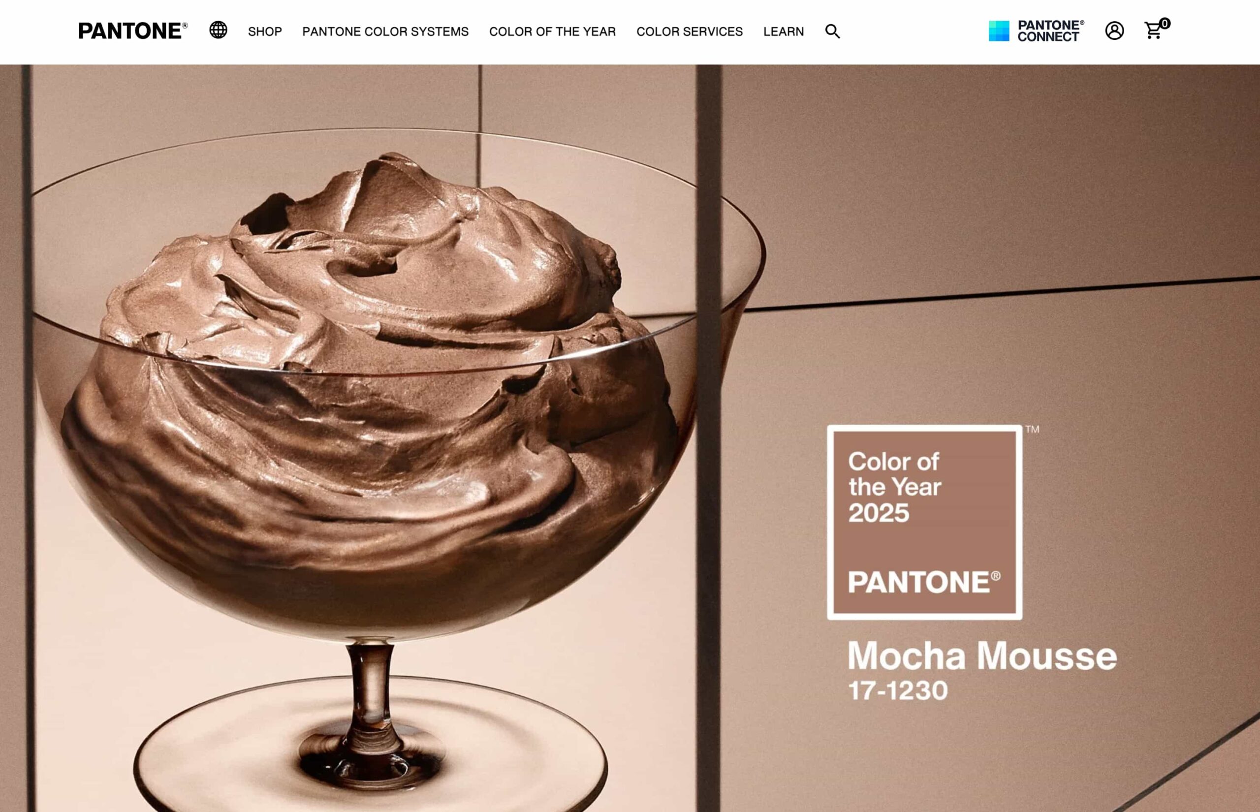
Screenshot from Pantone.com for reference
Before we float off into Cloud Dancer territory, can we take a moment to appreciate the absolute chokehold that Mocha Mousse 2025 had — and still has — on all of us?
Because let’s be honest:
The design world did NOT just “embrace” Mocha Mousse…
It collectively rebranded its entire personality around it.
Interiors? Brown.
Fashion? Brown.
Branding? Brown.
Pinterest? A warm, creamy, caffeinated fever dream.
Half of my closet? …brown. 😌
And here’s the thing:
I’m not a trend-hopper by any means — elegant neutrals are basically my personality and what I naturally gravitate toward.
But this one? This one played so perfectly into my personal aesthetic that I’m still fully living my best monochrome life.
Neutrals are elite, aesthetic, elegant af.
And I will defend my monochromatic wardrobe with my whole chest lol.
The point is:
Pantone does influence industries — weddings included.
We watched Mocha Mousse ripple into bouquet choices, tablescapes, stationery suites, brand palettes, and even wedding photography edits that leaned warmer, softer, moodier.
So while Cloud Dancer might look like a “non-color” at first glance…
Its impact might actually be bigger than you’d expect.
(And no, I am not emotionally prepared to give up my warm neutrals, but we can talk about that another day.)
Meet Cloud Dancer: The Soft, Airy “Non-Color” That Somehow Makes Total Sense
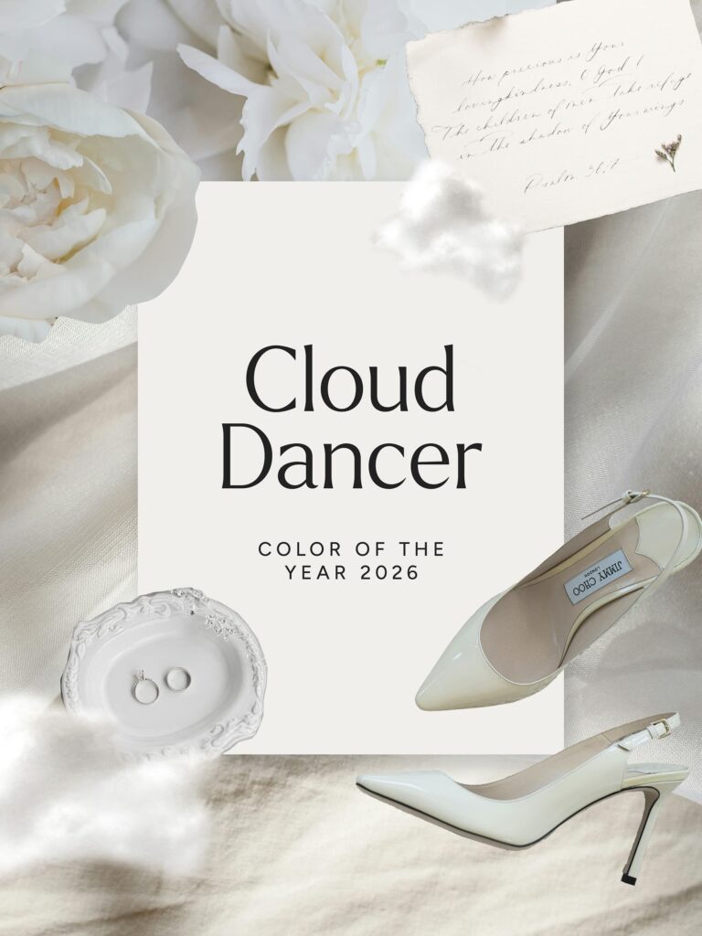 So… Cloud Dancer.
A poetic name for what is essentially: white.
Soft white. Airy white. Editorial white.
That crisp, clean, I-have-my-life-together kind of neutral.
And honestly?
After the warm, cozy, mocha-soaked era we’ve been living in, Cloud Dancer feels like Pantone collectively taking a deep breath.
It’s giving:
- elevated minimalism
- quiet luxury
- clean slate energy
- editorial simplicity
- “I’ve been meditating and drinking lemon water” core
- timeless, but not boring
And while the internet might be spiraling, the wedding industry has basically been fluent in Cloud Dancer since forever.
It’s the color of:
- gowns
- veils
- petals
- linens
- candles
- stationery
- flatlays
- half the Pinterest wedding boards ever created
Cloud Dancer isn’t new — it’s classic.
But its “Color of the Year” status signals something bigger:
👉 A continued shift toward refined, tonal, modern minimalism in weddings.
👉 Less clutter. More intention.
👉 Textures over bold color.
👉 Soft, editorial, elegant vibes that photograph beautifully.
And THAT is where this “non-color” starts to get interesting.
Predictions for Wedding Trends 2026 (Thanks to Cloud Dancer)
Cloud Dancer might feel like Pantone took a nap and forgot to pick a color —
but in the wedding world?
This shade actually has range.
White isn’t just white.
It’s texture, tone, depth, light, movement…
and when you layer it intentionally, it becomes luxury.
Here’s how Cloud Dancer is going to show up in 2026 weddings:
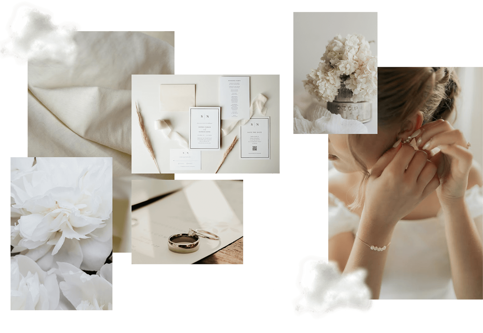
Tonal White Wedding Palettes (aka: “White, but Make It Stunning”)
The white-on-white trend? Oh she’s not going anywhere.
Expect to see:
- layered ivory + cream
- matte + satin contrasts
- stone vs linen textures
- tonal florals
- sculptural décor pieces
This is minimalism with MONEY energy.
Editorial. Romantic. Effortlessly modern.
Bridal Fashion & Accessories
Cloud Dancer is basically bridal couture’s love language.
We’ll likely see:
- ultra-clean minimal gowns
- pearls on everything
- cloud-like veils
- monochrome bridesmaid looks
- bows (because bows will never die apparently)
Photographers? Your detail shots are going to EAT.
Florals
If Mocha Mousse gave us warm, earthy florals…
Cloud Dancer is pushing things toward soft, sculptural, monochrome magic.
Think:
- all-white bouquets
- lush, cloud-like peonies
- orchids, ranunculus, anthurium
- baby’s breath (but modern, not 2012 prom)
- intentional shapes + negative space
- tone-on-tone florals that photograph like art
Stationery & Signage
Stationers are about to THRIVE — this color invites texture more than pigment.
Expect:
- cotton + handmade papers
- embossing
- blind letterpress
- translucent vellum
- linen envelopes
- creamy wax seals
This trend photographs ridiculously well in detail shots.
Tablescapes & Décor
This is where Cloud Dancer becomes a whole mood:
- creamy linens
- matte white candles
- ceramic vessels
- stoneware plates
- soft sculptural florals
- micro-textures everywhere
It’s giving: Michelin-star restaurant meets chic editorial wedding.
Overall Vibe of the Wedding Trends 2026
High-end, understated luxury.
Soft minimalism.
Architectural florals.
Neutrals with depth.
Textures that tell a story.
And a LOT of light, airy, elegant moments that feel refined without being sterile.
Cloud Dancer isn’t here to steal the show.
It’s here to make everything else look expensive.
What This Means for Wedding Photographers
Okay, photographers — this is where Cloud Dancer becomes your secret weapon.
Because while the internet is debating whether white counts as a color, you’re out here turning it into art.
Here’s how this “non-color” will actually shape your work in 2026 (and how you can use it to your advantage):
Your Exposure Game Will Level Up
White + weddings = a light meter’s emotional support nightmare.
But it also creates:
- cleaner highlights
- dreamy, airy backdrops
- soft, editorial skin tones
Cloud Dancer is basically an invitation to lean into clean, luminous imagery — the kind that looks effortless but secretly requires 10 years of experience and a good cup of coffee.
Editing Styles Will Skew Softer + More Refined
This trend supports:
- timeless edits
- minimal color grading
- calmer, more elegant tones
- less contrast, more natural light
- creamier whites (vs blown-out ones)
Think editorial, elevated, quiet luxury — all of which pair beautifully with modern, romantic storytelling style.
Flatlays & Details Are About to POP
Cloud Dancer is basically a built-in flatlay background.
Add:
- creamy stationery
- tonal textures
- delicate florals
- silk ribbon
- clear acrylic
- matte ceramics
…and suddenly every detail shot looks like it belongs in Vogue Weddings.
It Can Be the Perfect Aesthetic for Your Portfolio & Website
Here’s the thing:
Cloud Dancer only works magic if it actually aligns with your brand style.
If your vibe is modern, minimal, editorial, soft, or neutral-coded?
This trend feels like a warm hug from the universe — everything slots in naturally and makes your portfolio look beautifully cohesive.
But if your brand leans bold, colorful, nostalgic, moody, or documentary-driven?
You don’t need to force this into your work (actually, I’d strongly advise you to skip this trend altogether).
Trends should support your identity, not replace it.
The goal is to let Cloud Dancer enhance your visual storytelling — not send you into a rebrand spiral because Pantone said “soft white is in.” 😂
Pinterest Is Going to LOVE This
(But Only Use It If It Serves You)
Pinterest devours:
- soft neutrals
- tonal whites
- airy detail shots
- minimalist flatlays
- modern tablescapes
But here’s the strategic bit most people forget:
Your Pinterest should reflect your brand — not whatever Pantone is doing.
If Cloud Dancer fits your style?
Create a few pins that ride the trend wave.
They’ll last ages and keep bringing in dreamy traffic.
If it doesn’t fit your brand?
Skip it.
Pinterest is powerful because of consistency — not because you chase every aesthetic trend that surfaces online.
Use It in Your Marketing (Strategically, Not Reactively)
Playing with trends can be fun (and honestly, creatively refreshing)…
but they should never pull you away from your core brand strategy.
The strategic way to use Cloud Dancer:
- sprinkle it into detail shots
- create a small moodboard for your blog
- add one or two Cloud-Dancer-inspired images to Pinterest
- style a mini editorial around it if it aligns with your visual identity
- use the trend as a conversation piece in your marketing
But the key word here is intentional.
You’re not reinventing your brand every January based on a color announcement — that’s not branding, that’s self-sabotage with a color wheel. 😅
You’re choosing trends that naturally complement your aesthetic — and leaving the rest.
Because strategic branding is timeless…
and your brand strategy should be stronger than any color announcement.
Trends are optional tools — not directions.
What This Means for Wedding Planners, Florists & Stationers
Cloud Dancer may look simple, but it actually opens up a ton of creative opportunity — as long as it aligns with your signature aesthetic and the clients you want to attract. No pressure to adapt; just inspiration if it naturally fits.
Here’s how different wedding pros can use it intentionally:
For Wedding Planners
Cloud Dancer is a dream if your style leans:
- elevated minimalism
- tonal neutrals
- soft luxury
- calm, modern aesthetics
It can inspire:
- refined, tonal moodboards
- intentional tablescape concepts
- minimal venue layouts with layered textures
- simple-but-expensive-feeling design proposals
This trend pairs beautifully with planners who prioritize timeless, editorial storytelling.
For Florists
Florists are about to thrive — neutrals highlight shape, movement, and structure like nothing else.
Cloud Dancer supports:
- sculptural white arrangements
- tonal bouquets with depth
- negative-space floral design
- creamy, tactile blooms (orchids, ranunculus, peonies, anthurium)
- modern interpretations of baby’s breath
This is a trend that elevates floral art, not just arrangements.
For Stationers
Stationery designers get to lean into texture, dimension, and nuance — the parts of paper goods that feel luxurious and bespoke.
Expect more demand for:
- textured cotton papers
- blind letterpress
- embossing
- vellum accents
- creamy envelope tones
- minimal typography
Cloud Dancer isn’t about color — it’s about the quiet, elegant details that photograph incredibly well and elevate the whole experience.
Cloud Dancer Wedding Color Palettes for 2026
Cloud Dancer isn’t just “white.”
It’s a whole universe of soft tones, airy textures, and calming neutrals that play beautifully together.
Here are a few palette ideas you can use for inspiration, blogging, Pinterest, or even as a tiny mood boost on a Monday:
Palette 1: Tonal Whites (The Pure Cloud Dancer Moment)
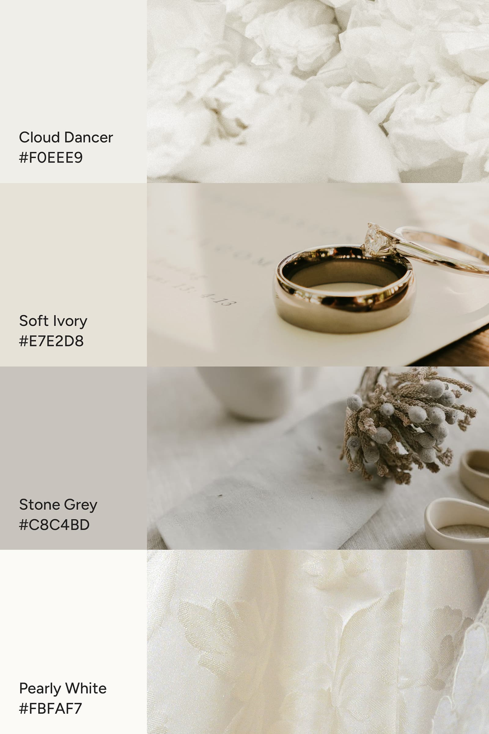
A clean, airy, editorial mix of whites that feels effortless and expensive.
- Cloud Dancer
- Soft ivory
- Stone grey
- Pearly white
Perfect for: modern minimal weddings, editorial photography, sculptural florals.
Palette 2: Modern Minimal Luxury

Minimal, refined tones that give “quiet luxury but with taste.”
- Cloud Dancer
- Matte black
- Champagne
- Charcoal
Perfect for: luxury venues, contemporary architecture, artistic flat details.
Palette 3: Soft Romance
A warm, dreamy twist that still feels neutral — ideal for romantic storytelling.
- Cloud Dancer
- Blush beige
- Dusty rose
- Warm taupe
Perfect for: garden weddings, soft floral arrangements, storytelling photographers.
Palette 4: Heritage Elegance
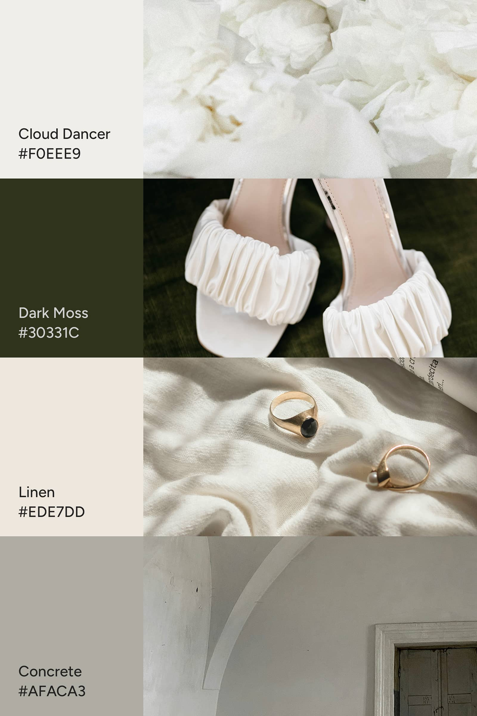
A rich, grounded palette inspired by deep moss greens, soft linen textures, and that moody-luxe, old-world elegance you get in historic European venues.
- Cloud Dancer
- Dark Moss
- Linen
- Concrete
Perfect for: refined minimalists, editorial weddings, autumn or European villa celebrations, and photographers who love neutral palettes with a touch of depth and drama.
Palette 5: The “I’m Not Over My Mocha Mousse Era” Palette
For the girlies (and creatives) who absolutely refuse to let go of their warm, chocolatey neutrals — good news: Cloud Dancer pairs beautifully with deep, rich browns.
This combo feels like:
old-money elegance, quiet luxury, and the warm hug of a perfect flat white.
- Cloud Dancer
- Deep mocha brown
- Soft oat milk beige
- Creamy linen
Perfect for:
luxury venues, autumn weddings, editorial photography, brides who love neutrals but want depth, and anyone still living their best mocha-coded life (solidarity).
Will This Color Fit Every Wedding? Spoiler: No — and That’s the Beauty of It
Here’s the honest truth:
Cloud Dancer won’t be the vibe for every couple — and that’s actually perfect.
Some couples adore bold color, rich palettes, moody vibes, or nostalgic tones.
And others want minimalism, neutrals, and that clean, airy elegance.
Both are valid. Both are beautiful. Both are worthy of timeless wedding photography.
Trends like this aren’t meant to dictate how every wedding should look;
they simply reflect where the broader aesthetic mood is drifting.
The magic is knowing when a trend genuinely supports:
- your brand style
- your artistic voice
- your dream clients
- your long-term portfolio
- your website aesthetics
…and when it doesn’t.
If Cloud Dancer aligns with your artistry?
Lean into it with intention.
If it doesn’t?
Celebrate the couples who crave color, drama, texture, warmth — or anything else that feels true to them (and you).
Weddings are personal.
Your brand is intentional.
Trends are optional.
Final Thoughts
So… Cloud Dancer.
The “color” that wasn’t really a color.
The announcement that made the internet spiral but made the wedding industry shrug and say,
“Yeah, we’ve been here.” 😌✨
And honestly? That’s kind of the beauty of it.
Because whether you lean into this trend or skip it entirely, this whole Pantone moment is a reminder of something bigger:
Your work — and your brand — doesn’t need a yearly color announcement to stay relevant.
You get to build a visual identity that’s timeless, intentional, and deeply aligned with what you’re here to create.
Trends like Cloud Dancer are simply invitations.
Optional tools you can borrow if (and only if) they genuinely support your style, your dream clients, and your creative expression.
If it feels aligned?
Amazing — sprinkle it into your shoots, your marketing, your Pinterest boards, or your content planning.
If it doesn’t?
Equally amazing.
Your brand gets to stay rooted, grounded, and true to itself — no trend-chasing required.
Either way, understanding where the industry is heading helps you stay aligned, strategic, and a tiny bit ahead of the curve (which future you will absolutely thank you for).
If you want to explore more ways to show up intentionally (without the overwhelm), you might love this one next:
👉 5 Simple 10-Minute Marketing Tips for Photographers to Boost Your Business
Intentional visibility, easy implementation, and zero trend-chasing — just grounded next steps.
Talk soon!
xx
Written by Kim Preis
Updated on December 7, 2025
